Lifeline Is a Safe Space

It's Just a Sticker, Right?
The History of Safe Space Logos and How They Help Create Safety
Submission by K Thomas, Project LIFE Clinical Training Manager
You might remember seeing logos on the walls of schools or a sticker on the door of a community provider identifying them as a “Safe Space.” But what does that mean and why does it matter? Can a sticker or a lanyard pin really make someone a more culturally responsive staff member?
The history of Safe Space images are important to understand how visible images foster safety. The origin of these images can be traced back to Nazi concentration camps as they used pink and black triangles to identify gay and lesbian prisoners. In the 1970’s, Queer activists began to reclaim these images of oppression as symbols of pride and resiliency. Today, we see the evolution of these images in LGBTQIA+ pride imagery, like rainbow flags and gender icons.
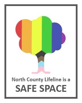
At Lifeline, we understand it’s important to create safe spaces for all identities, including our LGBTQIA+ clients. That’s why we’ve created our Lifeline Safe Space logo with the help of Queer leaders in San Diego County. Our logo shows the outline of the iconic Lifeline tree, with the colors of the progressive pride flag inside to honor the lives of Black, Brown, and transgender communities. We hope that when our LGBTQIA+ clients, community members, and staff see our new logo it will be a visible reminder that at Lifeline, we train our staff on cultural humility and work towards change together. At Lifeline: We see you. We hear you. We’re here for you.